Rowan Legal
Brief
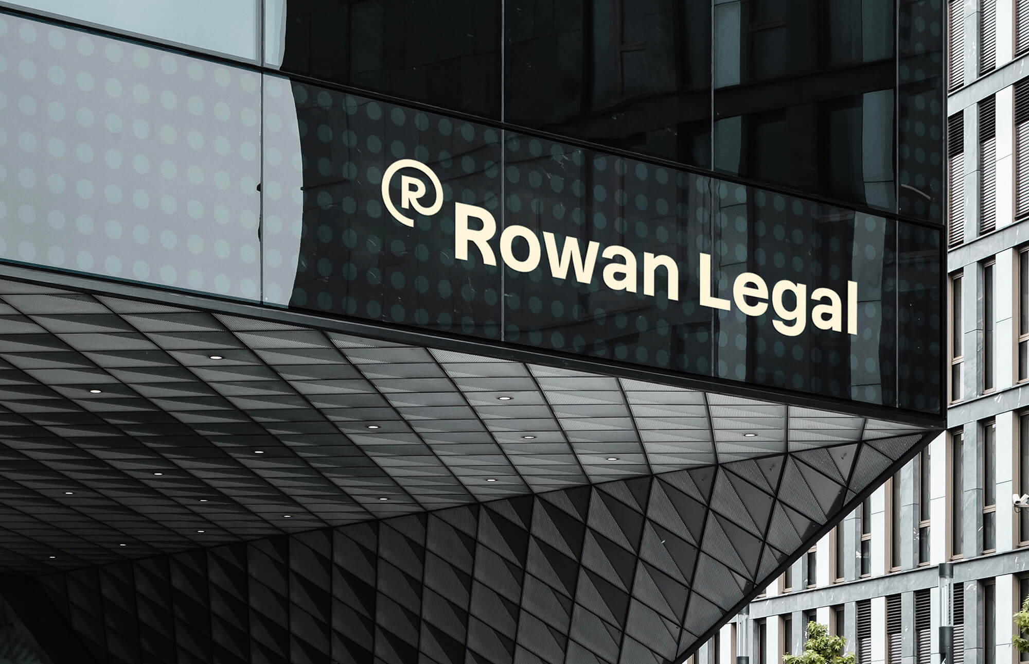
Rowan Legal is one of the top five law firms in the Czech Republic. They specialize in business clients and aim to become the second-largest law firm in the country.
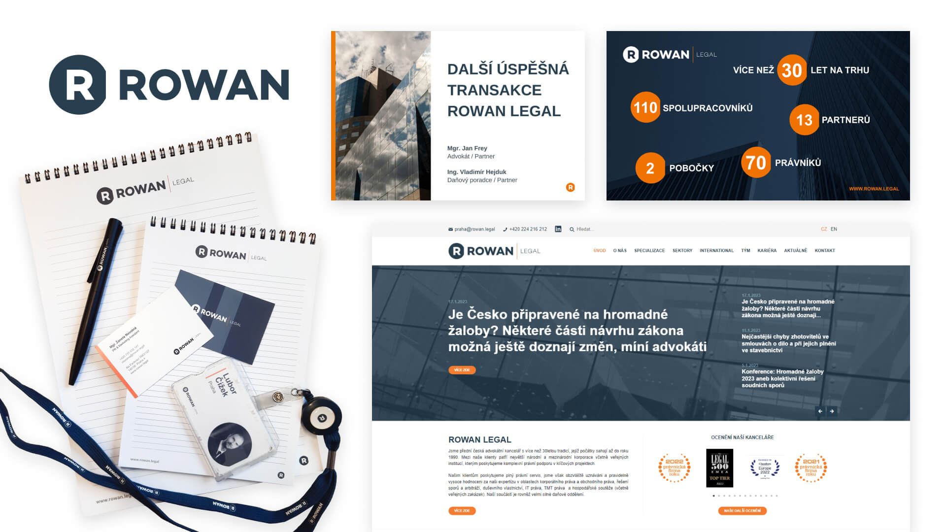
They held a competition to refresh their outdated and inconsistent visual identity, seeking a modern, cohesive design that reflects their growth and innovative approach. Rowan Legal was open to reworking their logo and color palette, aiming for a more unified, professional design that works seamlessly across digital and print materials, enhancing both internal and external communication.
Redesign
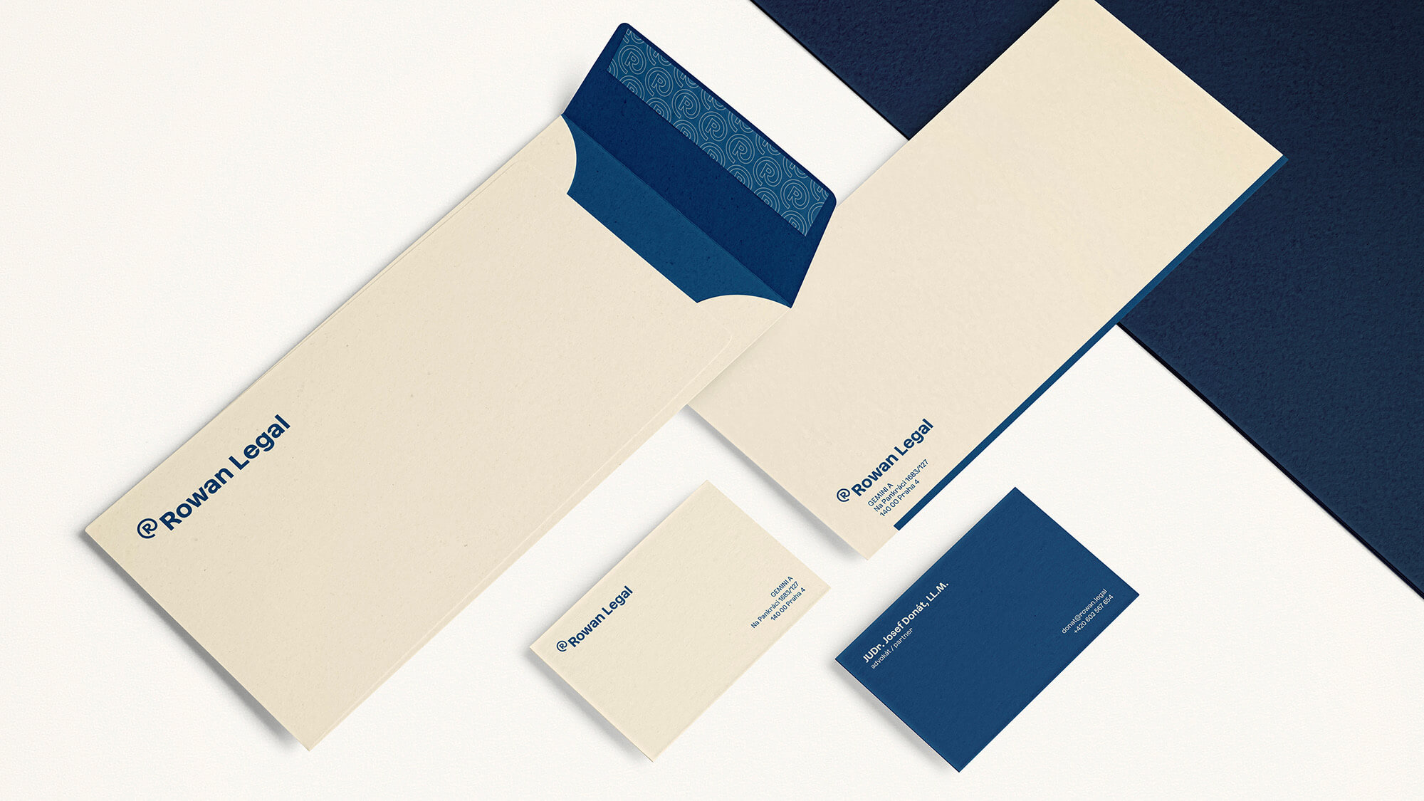
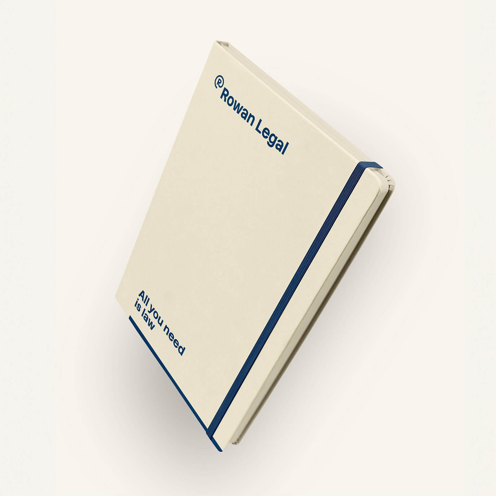
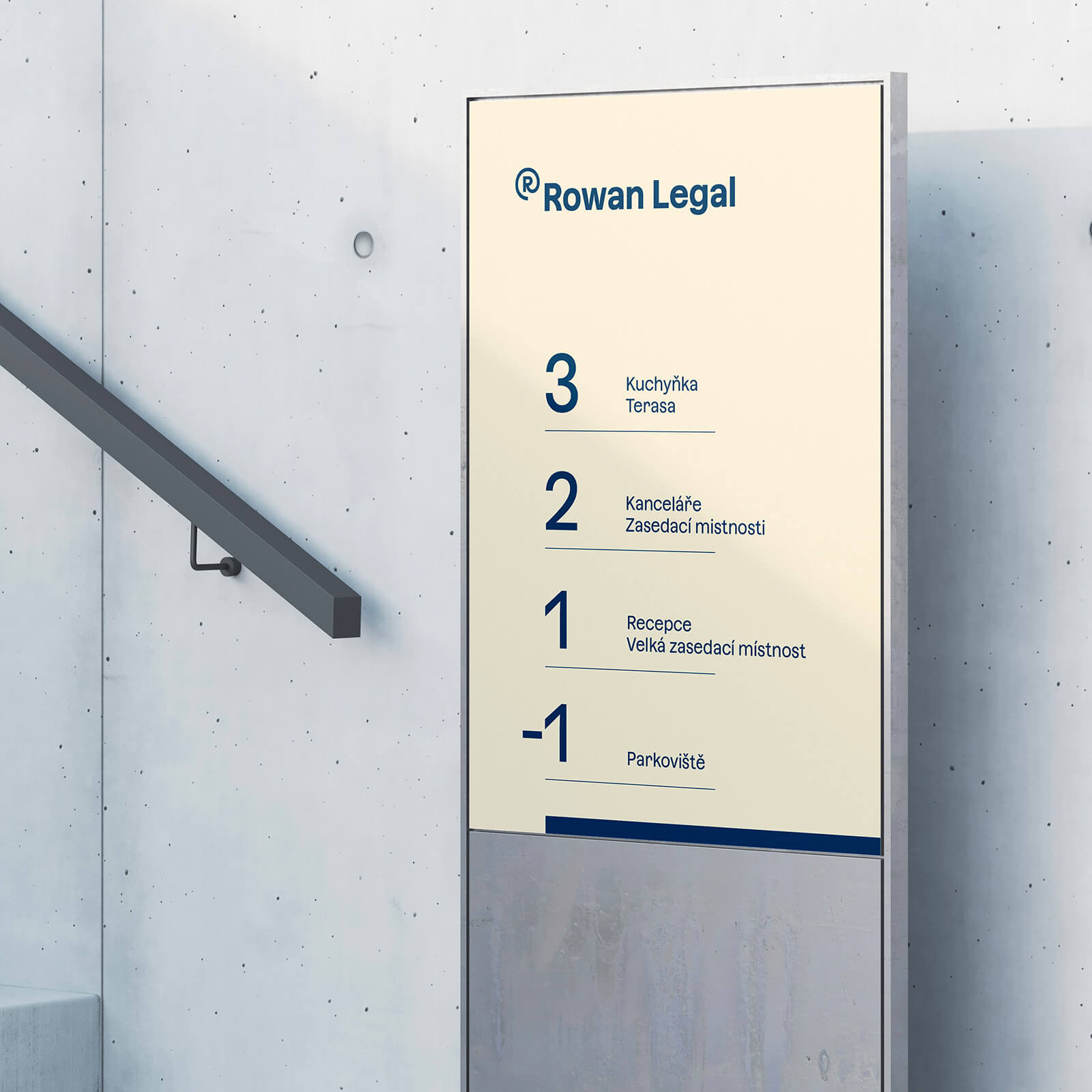
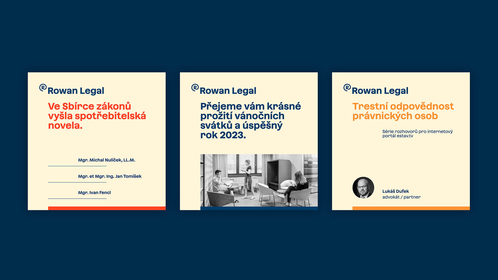
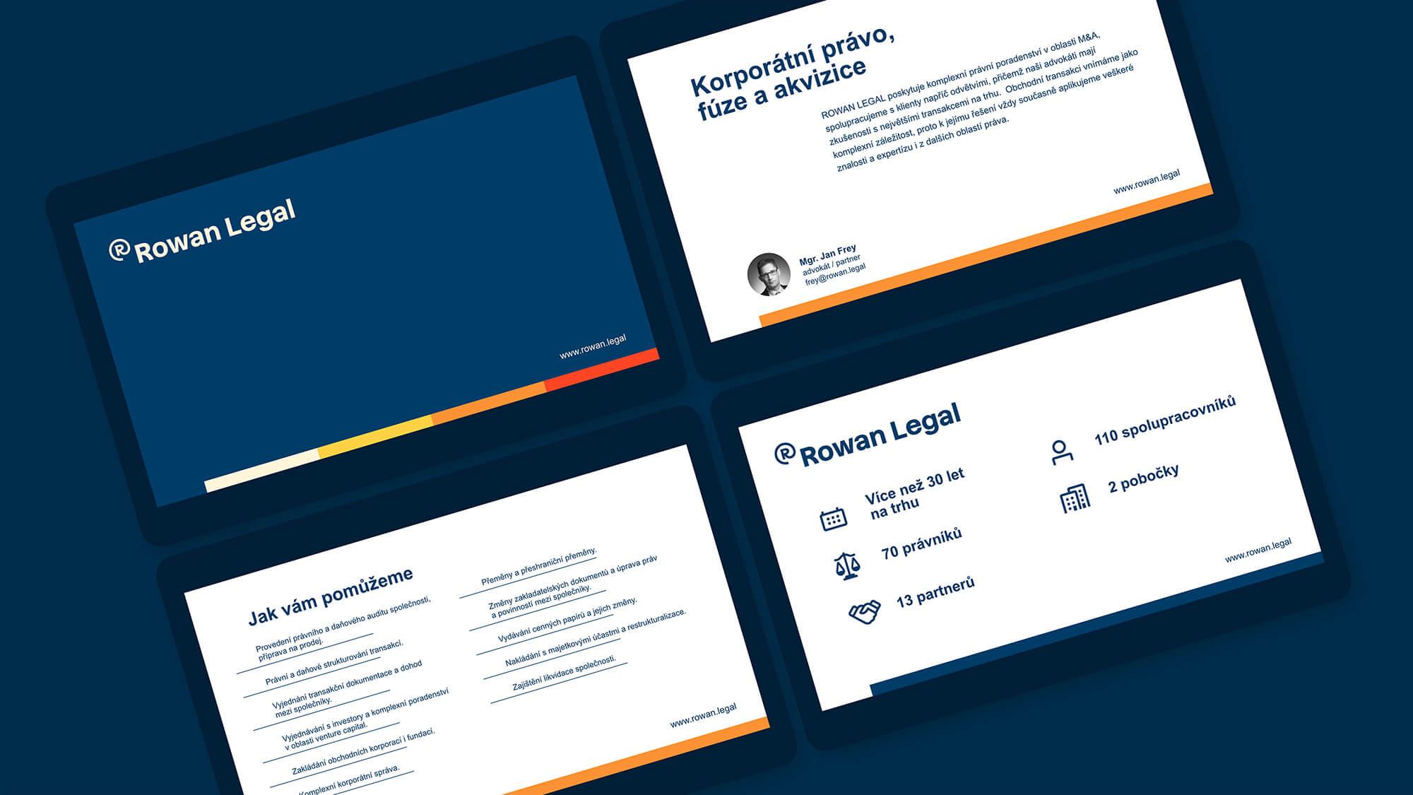
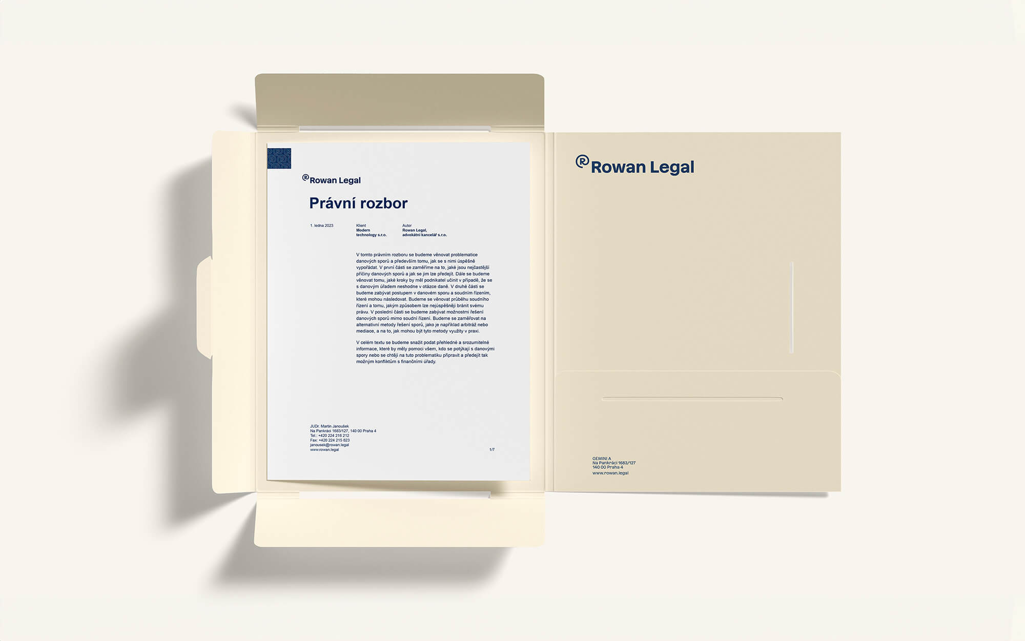
The new logo features a stylized "R" in a circle, maintaining a link to the previous identity. Its resemblance to the @ symbol reflects the firm’s modern approach and digital expertise. Positioned as a superscript, it alludes to the trademark symbol, highlighting services related to intellectual property. The color palette keeps the blue, now brighter, alongside orange and new shades of beige, yellow, and red, giving the identity a fresh yet professional feel.

Visual Identity Anna Fatrdlová
Art Direction Jakub Novák, Štěpán Landa
Created at Semibold
